
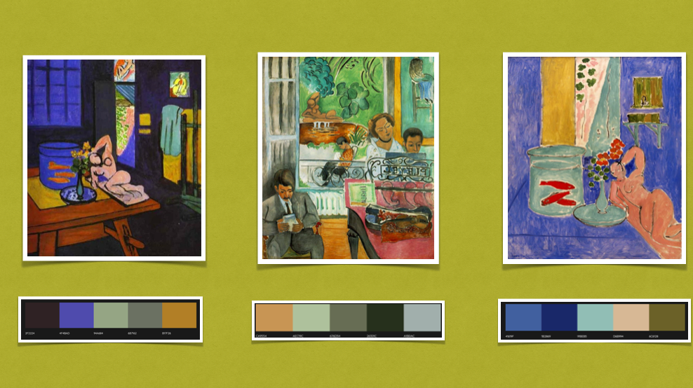


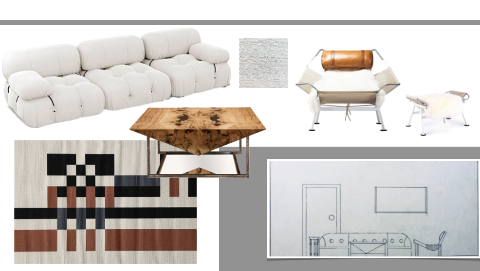
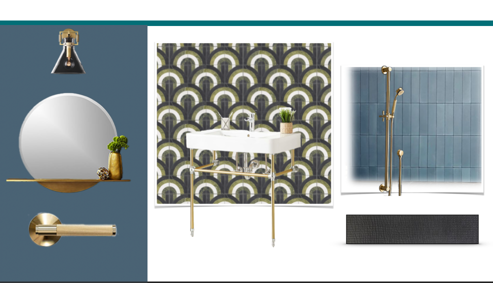

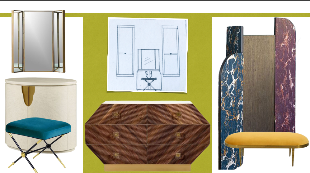
I was drawn to these paintings as the gamut of color variation was attractive to me as if I was shopping in a vintage store. Upon closer examination, his use of color reminded me of the Craftsman style architecture in Pasadena and Whittier. His pallet of colors in the wrong ratio would clash. Rather, Henri’s use of muted tones of bright colors worked harmoniously with one another. Using Earth tones with hues of blue, mustard yellow, and red orange. i wanted to use these toned down colors with an industrial styled update to the Craftsman homes of the 1910’s.